Design
Visual communication comes
full circle with the emoji
It’s hard to believe that the emoji, now such a part of our daily life, was originally designed as a little gimmick intended just for teens.
When the Japanese telecoms company DoCoMo made the heart emoji available on phones in the early ‘90s, it soon became clear that adults, too, were enamoured by this quick and easy way to demonstrate what they were feeling. According to Emojipedia, there are 3633 emojis available at the time of writing, and with World Emoji Day round the corner, it looks like the little yellow smiley, designed by Shigetaka Kurita, is here to stay. This got us thinking about how, despite the sophistication of 21st century life, in some ways, visual communication has come full circle.
A picture says 1000 words
From the earliest cave paintings, visual representations have been used to communicate complicated issues. But why are we still using them today? The simple truth is that visuals cut through a lot more quickly than words alone. Today, everybody’s time is precious; add to that the fact that we get bombarded with a million messages a day, and it’s easy to see why simplicity often attracts attention.
Think about the icons we pass every day – the simple H to represent Hospital, a white cross usually on a green or red background to represent First Aid, or a P to direct us to Parking. Those signs may not feel particularly inspired from a creative standpoint but their meaning is clear, practical and functional. During the pandemic, we saw just how essential visual communications became as a way to signpost complicated information quickly and easily to the general public. There was no room for ambiguity.
Clear + concise = cut through
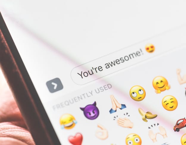
While some may argue that an emoji’s meaning can sometimes be ambiguous, they do allow us to express our feelings in simple but bold terms conveying a concise and (usually) clear message. They have the added advantage of cutting across language barriers – everyone knows what the heart emoji represents (we couldn’t possibly comment on the aubergine 🤣).
"There’s no denying basic emojis have become an iconic mode of communication."

So where does the emoji sit in the design world? Creatively it might be viewed as basic or lowbrow, but could also be seen as the ultimate in design communication. It does the same job as any good piece of design – we’re often asked by clients to turn a page of heavy text into a piece of snappy creative without losing the underlying message. We might consider employing a strong palette of bold ‘action’ colours to draw our audience in and then use emotive language to keep them interested – some of the very same logic and design principles could quite easily be applied to the humble emoji! The visual appeal of the emoji should not be underestimated.
How should brands use emojis?
You could argue that brands use emojis every day – in the form of their logo. While not strictly the same thing, if a visual identity is done right, it should do the same job as an emoji – connect with you emotionally. (You can read more about the difference between a good and bad logo here.)
There’s no denying basic emojis have become an iconic mode of communication. Generally, emojis have a softening effect, both literally – circles are a soft shape – and figuratively – they can represent a friendly nod, a breaking down of boundaries. (If they were designed as triangles, it might have been a completely different story!) That said, there’s a time and a place, and a misguided emoji can cause all sorts of upset.
Taco Bell was praised for its use of the emoji in marketing when it petitioned for the taco to become an official emoji, whereas an emoji-filled tweet from the bank Goldman Sachs was met with derision. Like any communication, what’s right for one audience may be completely inappropriate for another. Ultimately, a strong brand essence, a clearly defined tone of voice and a deep understanding of your audience should dictate how you communicate to them, regardless of the medium. And that’s where we come in – we love nothing better than getting to the heart of your brand essence, defining your tone of voice and working out the best way to express your brand better visually. Sound interesting? Let’s chat!