Design
Why packaging design and
product development
go hand-in-hand
When you look around our studio, the samples and prototypes we’ve collected over the years show that packaging design has been – and still is – a huge part of our portfolio. We’ve designed food packaging for M&S, motor-oil packaging for Shell and, back in the day, Duckhams; Commodore Vic-20 videogame sleeves (also way back when!); PG Tips tea bag boxes and everything in between. For most of these projects, the brands we work with have supplied us with the packaging specifications, so our job is to create the best design for the packaging.
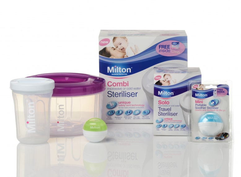
One of our most memorable projects, however, allowed us not only to design the visual elements, but to also work directly with a product design agency as part of a bigger brand refresh. Initially briefed as an industrial/mechanical product design project for Milton, we were brought on board to work with the product design agency, Wright Design, when the scope was extended to a complete brand refresh, including brand ID development, packaging design, photography and a new website.
Don’t throw the baby out with the bath water
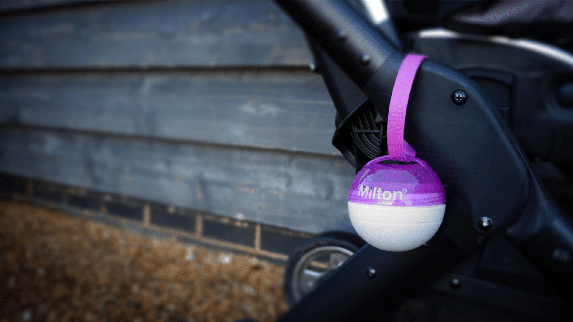
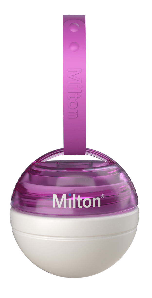
After more than 65 years of producing sterilising and hygiene products for babies, Milton was preparing to launch a brand-new product range – mini portable sterilisers, which would allow parents to clean and sterilise dummies while out and about.
It was essential that the package design expressed a contemporary feel whilst maintaining the heritage of an established brand for this very modern range of products. Our job was to meld together this sense of establishment with a contemporary design approach. The two agencies, Wright Design and Greenwich Design worked closely together to ensure as much synergy as possible throughout the project.
As a product design agency, much of Wright Design’s work is developing new designs for existing ranges where the branding or packaging design doesn’t need to change. In the case of Milton, the scope of the brief was much greater. We were given the closest thing to a clean sheet of paper – a brief that allowed us to feed into both the product design and the packaging process, and also to modernise Milton’s logo to reflect the modernity of the new products, while respecting the established nature and equity of the brand.

Establish who’s leading the project
We knew from experience the biggest challenge in getting a product to market with different agencies and lots of components involved, was to ensure the end result looked coherent, and from one source. It was essential at the beginning of the project to establish whether it would be product-led or brand-led. In this case, the product design was the hero and that dictated the look and feel of the visual marketing communications and tone of voice. Greenwich Design’s challenge was to ensure this translated beyond the packaging onto the website and into all campaign materials. We created a toolkit for use across the business with guidelines and a clear house style that would hold everything together.
It was a fantastic project to work on and we were delighted when Milton’s brand manager complimented us on bringing “modernity and emotion to the brand.” Not every collaborative project has been quite so satisfying, but our learnings from previous experiences certainly paved the way for a smooth, more logical process.
"The two agencies, Wright Design and Greenwich Design worked closely together to ensure as much synergy as possible throughout the project."

Another product design project comes to mind – one that’s memorable for all the wrong reasons! We were forced to try and fit a lengthy product name onto a tiny area of a bottle. It was obvious that the packaging had been chosen independently and without any thought to how the label and the graphics on the label would work. It was an enormous struggle for us to apply the long brand name to such a small space and the results were less than satisfactory. The final packaging lacked impact from a branding perspective and failed to do the right communications job.
Synergy is everything
Another project that helped us to understand the importance of collaboration between agencies was a National Trust brief with a number of different stakeholders. We were responsible for the Point of Sale, while JWT worked on the above-the-line advertising and you couldn’t have had two more different interpretations for the same campaign! Theirs was retro in style, whereas ours was very modern. It was a perfect example of where key stakeholders should have been talking to one another throughout the process. This project from the 1990s served as a valuable lesson in the importance of synergy and that has stayed with us ever since, and was an essential component in the success of the Milton project.
There have been notable cases of product designs missing the mark in recent years – Dove’s attempt to introduce limited edition bottles in all shapes and sizes to celebrate body diversity was viewed as insulting, gimmicky and met with derision. It wasn’t consistent with their brand ethos. In contrast, when Virgin Cola introduced the ‘Pammi’ bottle, based on Pamela Anderson’s figure, they got away with it because it was entirely in line with their slightly laddish approach; being controversial was part of their brand DNA. That’s why it’s just not enough for the product development process and the design process to intersect somewhere along the way – they should be working hand-in-hand from the beginning. This ensures the product is developed with communication in mind, allowing the design to reflect the values of the brand, and putting the end consumers’ needs at the fore.